
Happy Press Co. Google profile banner artwork

Brand Insights · Case Study

Happy Press Co.

A brand-to-storefront transformation for a San Antonio juicery, spanning rebrand, product presentation, environmental graphics, spatial planning, and Square-hosted digital takeover support after the business changed ownership.

Home / Portfolio / Brand Insights

Brand Systems

Overview

Happy Press Co. was acquired from a previous owner who was primarily operating through farmers markets while producing juice from the kitchen inside the commercial space. With the new owner taking over the brand and the property, the work shifted from maintaining a market-only identity to creating a stronger retail-facing business: a rebrand, a clearer value proposition, a customer-facing storefront layered onto the existing production kitchen, and a connected digital presence that could support ordering, discovery, and launch momentum.

  • Reframed the acquired business with a new value proposition around `Raw. Local. Fresh.` and a more customer-facing storefront identity.
  • Extended the brand into bottles, print collateral, window graphics, banners, kitchen-adjacent retail planning, and launch visuals.
  • Helped the new owner establish the Square-hosted website, ordering flow, Google presence, and connected digital channels.

Project Highlights

From legacy market business to branded storefront, the rollout connected identity, space, and digital operations.

The work was not just a visual refresh. It helped the new owner take over a legacy juice business, retain the commercial kitchen for production, create a customer-facing retail environment, and establish a more complete digital storefront and account ecosystem around the new chapter of the brand.

  • Bright citrus-led identity system applied across retail, product, and digital touchpoints.
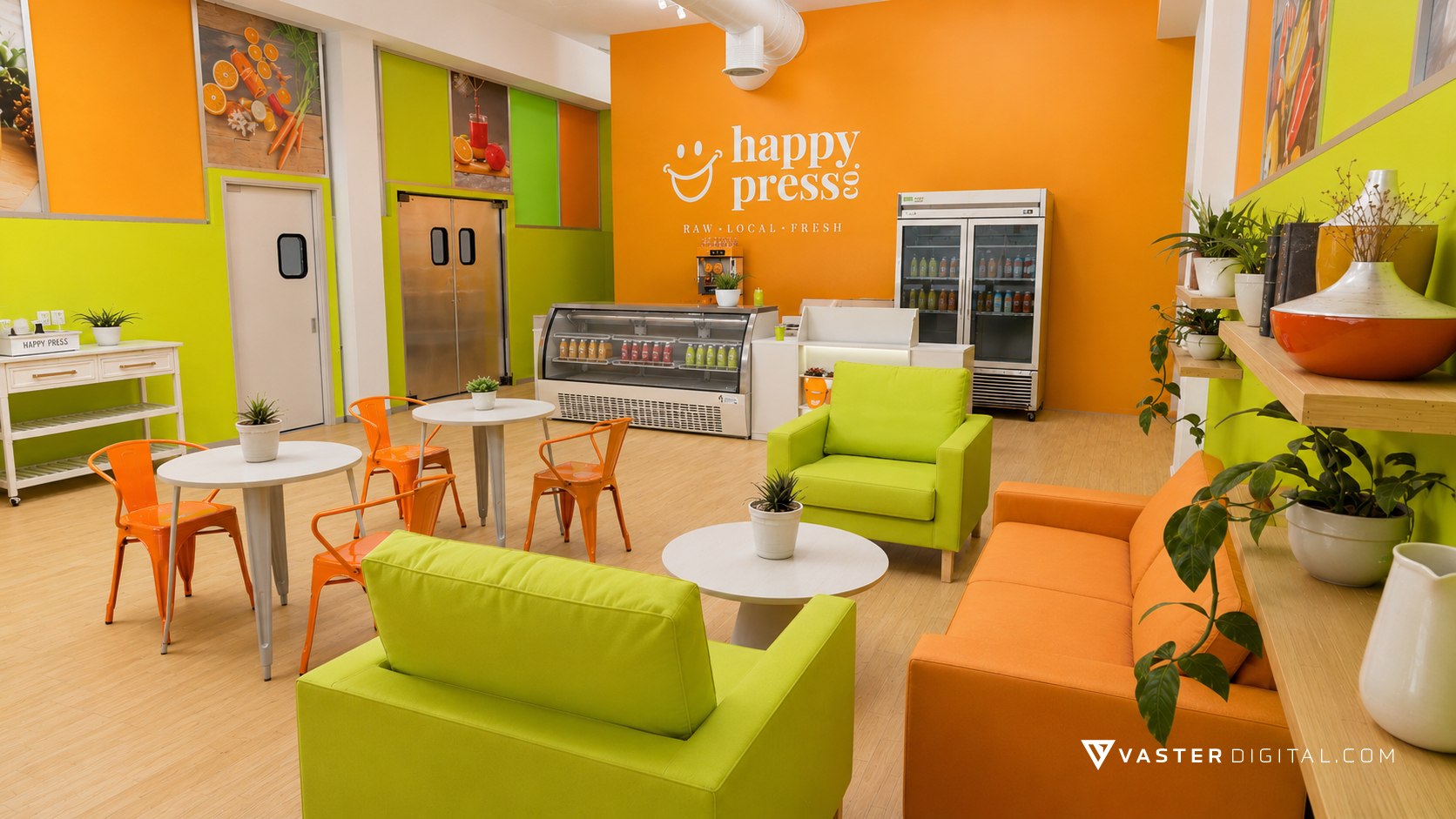
  • Storefront planning and environmental graphics helped turn an operational production space into a customer-facing destination.
  • Website, Google, and channel setup support helped the new owner take over the business with a more connected digital presence.

Case Study Detail

How the work came together across touchpoints.

Happy Press Co.

Brand Foundation And Positioning

The brand story anchored Happy Press Co. in freshness, community, and local sourcing. That narrative informed a visual system built to feel cheerful, premium, and immediately legible across storefront, bottle, and promotional surfaces.

  • Primary logo system with horizontal and vertical lockups.
  • Color palette centered on citrus orange, golden yellow, and fresh greens.
  • Tagline and typography used consistently to reinforce the `Raw. Local. Fresh.` promise.

The core logo system established the tone for the broader brand-to-space rollout.

Happy Press Co.

Product And Menu-Facing Imagery

The product work made the bottles themselves part of the brand system. Individual label photography, lineup imagery, and menu-ready visuals helped turn the juice selection into something recognizable, ownable, and ready for both retail and digital ordering contexts.

  • Lineup and single-product imagery for key juice offerings.
  • Menu-oriented compositions supporting pricing and product selection.
  • Consistent label presentation across multiple flavor families.

Lineup photography made the product range feel cohesive across retail and digital ordering contexts.

Happy Press Co.

Environmental Graphics And Signage Rollout

The brand extended well beyond packaging. Exterior window wraps, banners, and branded environmental graphics translated the new identity into a real-world storefront presence that was visible from the street and coherent once customers stepped inside.

  • Exterior and interior window-wrap system tied to the established palette.
  • Large-format banners for in-store and promotional visibility.
  • Main-wall and frontage treatments reinforcing the logo and brand voice during the transition into a retail-facing space.

Window-wrap applications helped announce the new storefront from the street.

Happy Press Co.

Spatial Planning And 3D Visualization

Planning support helped connect the visual identity to how the physical environment would actually work. Because the kitchen remained central to production, the new retail environment had to be designed around an already-active commercial footprint rather than from a blank slate. Floor-plan references, wall elevations, and 3D renders provided a practical bridge between brand design and a workable storefront.

  • Scaled floor-plan thinking for fixture placement, production adjacency, and customer flow.
  • Main-wall concepting aligned the brand with the interior focal point while preserving kitchen functionality.
  • Rendered 3D views and walkthrough support previewed the storefront before full execution.

Visualization work connected the new brand to a workable retail environment around the retained kitchen.

Happy Press Co.

Website And Storefront Support

The digital component was a meaningful part of the ownership transition, not just a small add-on. We worked closely with the client on the Square-hosted website and storefront, helped shape the menu/order presentation, connected the business across its channels, and supported the takeover of Google and social-facing accounts so the new storefront had a coherent public presence online as well as in person.

  • Square-hosted website and digital storefront setup tailored to the new owner and the updated brand.
  • Customer-facing menu, ordering, and storefront presentation built to support a real retail location rather than a market-only business.
  • Google and social/channel setup support integrated into the overall digital takeover and launch process.

The Square-hosted site helped the new owner present the business as a real storefront, not just a market vendor.

Project Gallery

Selected assets from the Happy Press rollout.

The work spans identity, product presentation, environmental graphics, storefront planning, and digital setup for the business transition.

Back To Brand Work

Review more branding projects or explore how identity scales into real environments.

This case study captures the Happy Press rollout from logo system to storefront presence.